Designing features
in Pencil

Designing features
in Pencil

Creating whiteboard, video call and admin experiences for students and tutors

Creating whiteboard, video call and admin experiences for students and tutors

My Role

Product Designer | Idea Generation, UX Research, Information Architecture, User Flows, Prototyping, Brand Application

Product Designer | Idea Generation, UX Research, Information Architecture, User Flows, Prototyping, Brand Application

Team Size

3-5 members

3-5 members

Duration

2 years, 6 months

2 years, 6 months

Tools

Figma, Figjam, Notion, Goodnotes

Figma, Figjam, Notion, Goodnotes

Overview

From Pencil Spaces' debut at September 2021, many features were added, not only to adapt to the ever-changing online tutoring industry, but to address user feedback and requests.

From Pencil Spaces' debut at September 2021, many features were added, not only to adapt to the ever-changing online tutoring industry, but to address user feedback and requests.

This case study highlights many of the features I designed over the years, but is not indicative of all my work. There are features where I have closely collaborated with other designers at the time, but mostly I was the only designer and/or took responsibility of the feature.

This case study highlights many of the features I designed over the years, but is not indicative of all my work. There are features where I have closely collaborated with other designers at the time, but mostly I was the only designer and/or took responsibility of the feature.

For the sake of this case study, three features will be highlighted: Object toolbar, Screenshare annotation and Participant Manager.

For the sake of this case study, three features will be highlighted: Object toolbar, Screenshare annotation and Participant Manager.

CONTEXT

Pencil wanted online learning to be just as engaging as in-person sessions

When Zoom took off as the major video call platform to replace in-person classes, Pencil believed that online classes could be more than just talking through a screen.

When Zoom took off as the major video call platform to replace in-person classes, Pencil believed that online classes could be more than just talking through a screen.

problem

How can online learning be engaging?

In online sessions, students can be distracted by social media or streaming services due to the convenience of opening these applications via another tab or by another handheld device. Thus, it is much more difficult to maintain a student's attention as compared to in-person settings.


By ensuring a student's attention to the online class, it is not only important to have useful tools within the video call, but also features that can make teaching dynamic and accessible.

In online sessions, students can be distracted by social media or streaming services due to the convenience of opening these applications via another tab or by another handheld device. Thus, it is much more difficult to maintain a student's attention as compared to in-person settings.

By ensuring a student's attention to the online class, it is not only important to have useful tools within the video call, but also features that can make teaching dynamic and accessible.

Constraints

Limited resources: Due to the company being within a competitive landscape, resources were allocated elsewhere. There were a few user interviews and user testing, but nothing organized formally.

Technological constraints: Due to engineering constraints, certain features were not feasible to implement.

💡

The challenge is to create a platform that fosters engaging learning experiences.

The challenge is to create a platform that fosters engaging learning experiences.

solution

Features are organized into three categories: Whiteboard, Video Call and Admin experiences

object toolbar

Problem: Current whiteboard objects had different toolbars

This also extended to different states of the same whiteboard object

This also extended to different states of the same whiteboard object

For shape objects, toolbar states were different

Generally shape objects (such as a line, square and arrow) would have a grey toolbar. However, when a user wanted to lock a shape, a blue toolbar is shown instead.

Generally shape objects (such as a line, square and arrow) would have a grey toolbar. However, when a user wanted to lock a shape, a blue toolbar is shown instead.

Image objects had a different toolbar than shape objects

  1. The color for image object toolbars were blue instead of grey

  2. The image toolbar sits vertically on the left, instead of a horizontal orientation at the top.

  1. The color for image object toolbars were blue instead of grey

  2. The image toolbar sits vertically on the left, instead of a horizontal orientation at the top.

Solution

Improvement One: Choosing a horizontal toolbar to optimize clarity and reinforce familiar behavior

Horizontal toolbars allow elements to be screened through a familiar left-to-right direction. This also coincides with all the other menus in Pencil Spaces (such as the white toolbar where a user accessed whiteboard objects)

Horizontal toolbars allow elements to be screened through a familiar left-to-right direction. This also coincides with all the other menus in Pencil Spaces (such as the white toolbar where a user accessed whiteboard objects)

I also explored edge-cases if objects were cut off from the viewport, was still clickable.

I also explored edge-cases if objects were cut off from the viewport, was still clickable.

Improvement Two: Creating a high contrast from the whiteboard to the toolbar promotes user focus

This allows user to not be distracted by any of the elements within the whiteboard and actually focus on the action towards their selected whiteboard object. This is further reinforced from the toolbars of Whimsical and Figjam.

This allows user to not be distracted by any of the elements within the whiteboard and actually focus on the action towards their selected whiteboard object. This is further reinforced from the toolbars of Whimsical and Figjam.

screenshare annotation

Problem: Teachers requested a screenshare annotation feature

This user request was not only useful for interacting with different screens, but was a familiar feature present in other competitors, such as Zoom.

This user request was not only useful for interacting with different screens, but was a familiar feature present in other competitors, such as Zoom.

💡

Adding this feature ensured that teacher's workflows can be further integrated into the platform, improving user satisfaction

Adding this feature ensured that teacher's workflows can be further integrated into the platform, improving user satisfaction

Solution

However, some problems occurred once this workaround was pushed to product.

However, some problems occurred once this workaround was pushed to product.

Due to engineering constraints, one could not directly annotate the screen within the current screenshare. A workaround was proposed, where the screenshare would be added onto the whiteboard. By making the screenshare an interactive element, a user can write on top of the screen.

Due to engineering constraints, one could not directly annotate the screen within the current screenshare. A workaround was proposed, where the screenshare would be added onto the whiteboard. By making the screenshare an interactive element, a user can write on top of the screen.

1st Iteration: Whiteboard tools are used for annotation

Problem: The workaround required additional steps:

The extra steps were that the user had to click onto the "Add to Board" action. A problem was that this action did not clearly convey that this was for screenshare annotation. However, explicitly stating what the action did was decided rather than fostering more user confusion if the action was named "Screenshare Annotation"

The extra steps were that the user had to click onto the "Add to Board" action. A problem was that this action did not clearly convey that this was for screenshare annotation. However, explicitly stating what the action did was decided rather than fostering more user confusion if the action was named "Screenshare Annotation"

Problem 2: The workaround was not a true "Screenshare annotation"

As the screen was a whiteboard object, it was constrained within the whiteboard. Thus, if the screen was in a selected state, any of all annotations would be hidden behind the screen. This generated user confusion, as it resulted in an unexpected action, and conveyed that the annotations were temporary without their consent.

As the screen was a whiteboard object, it was constrained within the whiteboard. Thus, if the screen was in a selected state, any of all annotations would be hidden behind the screen. This generated user confusion, as it resulted in an unexpected action, and conveyed that the annotations were temporary without their consent.

As the screen was a whiteboard object, it was constrained within the whiteboard. Thus, if the screen was in a selected state, any of all annotations would be hidden behind the screen. This generated user confusion, as it resulted in an unexpected action, and conveyed that the annotations were temporary without the user's consent.

2nd Iteration: Screenshares have direct annotation tools

The next iteration reduced additional steps and provided a clear action for Screenshare annotation. This was made possible due to current engineering capability, so that screenshares are now able to have direct annotation tools. Thus, teachers can now seamlessly transition from adding a screenshare to interacting with it directly.

The next iteration reduced additional steps and provided a clear action for Screenshare annotation. This was made possible due to current engineering capability, so that screenshares are now able to have direct annotation tools. Thus, teachers can now seamlessly transition from adding a screenshare to interacting with it directly.

participant manager

Problem: Many user requests were to manage multiple people within a session

The user requests brought in asked for specific features but fell under the umbrella of managing people.

The user requests brought in asked for specific features but fell under the umbrella of managing people.

💡

This is one of the first features I worked on around the time Pencil Spaces launched.

This is one of the first features I worked on around the time Pencil Spaces launched.

Solution

An information architecture was made to categorize these features into similar behaviors:

  • Controls: Direct actions to the participant

  • Settings: Allowing actions for the participants

  • Requests: Participants can request for actions

  • Attendance: Recording participant's presence

An information architecture was made to categorize these features into similar behaviors:

  • Controls: Direct actions to the participant

  • Settings: Allowing actions for the participants

  • Requests: Participants can request for actions

  • Attendance: Recording participant's presence

Controls: Tutors can mute/unmute a student if they cause disturbances

1st Iteration: Having a side panel where tutors have a set of actions on students

This side panel allowed for teachers to access the participant manager while still being present within the session. The controls panel provided information on a participant's status, and the primary actions for a participant: chat, mute, turn camera off and follow.

This side panel allowed for teachers to access the participant manager while still being present within the session. The controls panel provided information on a participant's status, and the primary actions for a participant: chat, mute, turn camera off and follow.

However, from both user and stakeholder feedback, the controls panel was overwhelming to use.

However, from both user and stakeholder feedback, the controls panel was overwhelming to use.

This feature was one of the first tasks I worked on around the time Pencil Spaces launched.

This feature was one of the first tasks I worked on around the time Pencil Spaces launched.

2nd Iteration: Reduce visual complexity

In the next iteration, multiple things were changed in order to reduce visual complexity and opt for simplicity and clarity.

In the next iteration, multiple things were changed in order to reduce visual complexity and opt for simplicity and clarity.

Improvement: Minimize primary actions

Based on the user feedback and usage, the primary actions of mute and camera off were common actions in regards to follow and chat. Thus, by prioritizing these two actions with the rest within an overflow, the visual complexity is reduced.

Improvement: Statuses had simpler shapes

These statuses had to immediately inform the teacher of the participant's state; such as being present in the call (as represented by a green phone). However, the 1st Iteration had two states present in two different positions, generating user confusion and visual noise.

These statuses had to immediately inform the teacher of the participant's state; such as being present in the call (as represented by a green phone). However, the 1st Iteration had two states present in two different positions, generating user confusion and visual noise.

These statuses had to immediately inform the teacher of the participant's state; such as being present in the call (as represented by a green phone). However, the 1st Iteration had two states present in two different positions (being present in a call and the user is using a mobile device), generating user confusion and visual noise.

By determining one position for all statuses to appear allows the user to be familiar with the nature of these statuses and notice when a participant's state changes. For example, if a participant was present in the call, but was distracted (a user request), the status changed from a green phone symbol to an orange moon.

By determining one position for all statuses to appear allows the user to be familiar with the nature of these statuses and notice when a participant's state changes. For example, if a participant was present in the call, but was distracted (a user request), the status changed from a green phone symbol to an orange moon.

Improvement: Highlight one primary action to be applied to all participants

From the 1st Iteration, there were primary actions highlighted that could be applied to all participants. In other words, a teacher could mute all participants through this highlighted row.

From the 1st Iteration, there were primary actions highlighted that could be applied to all participants. In other words, a teacher could mute all participants through this highlighted row.

Many changes were made from the 1st Iteration to 2nd Iteration:

From the 1st Iteration, there were primary actions highlighted that could be applied to all participants. In other words, a teacher could mute all participants through this highlighted row.

Many changes were made from the 1st Iteration to 2nd Iteration:

Many changes were made from the 1st Iteration to 2nd Iteration:

Substitute a person icon to a stack of avatars

The person icon implied that the actions related to this icon only happened to one person. By replacing the icon with a stack of avatars, the teacher can see all of the participants that would be affected by the actions at a glance.

The person icon implied that the actions related to this icon only happened to one person. By replacing the icon with a stack of avatars, the teacher can see all of the participants that would be affected by the actions at a glance.

Choosing "Everyone" other than "All participants"

The "Everyone" text reduced visual noise (one word than two) without compromising the clarity of what the highlight action meant. The text was also a much more accessible word than "All participants", reducing additional comprehension of what a participant was before understanding what "All participants" mean.

The "Everyone" text reduced visual noise (one word than two) without compromising the clarity of what the highlight action meant. The text was also a much more accessible word than "All participants", reducing additional comprehension of what a participant was before understanding what "All participants" mean.

The highlight action was only "Mute all"

From the 1st Iteration, it was feasibly impossible for certain actions to be applied to all participants at the same time. For example, one could not follow everyone simultaneously. Rather than removing the follow action completely from the row, it was faded to render the action unusable.

  • This also contributed to visual complexity and user confusion, as these actions can be easily misunderstood as interactive buttons, but due to an error, was not clickable.

  • By removing all the non-feasible actions that could be applied to all participants, microphone and camera were the only actions that could be present on the row.

  • Due to user feedback, muting everyone was a more popular action than disabling all camera. This allowed for a primary button with a clear text to indicate that this action would mute all participants.

💡

Note: The 2nd Iteration also had an accordion system where participants were ordered into online, offline, and invited categories. This helped the teacher discern which participants were actually within the session, which participants had access to the Space, but were not present, and which participants were invited.

Note: The 2nd Iteration also had an accordion system where participants were ordered into online, offline, and invited categories. This helped the teacher discern which participants were actually within the session, which participants had access to the Space, but were not present, and which participants were invited.

Permissions: Teachers can allow/restrict Student's use of a mic

1st Iteration: Granular control of certain privileges for certain participants

One major user request was to manage disruptive participants, in which these participants would use their microphone or cameras improperly. What was tricky about this user request was that only the disruptive participant's actions were locked, and all the other participants could freely user their microphone and camera.

One major user request was to manage disruptive participants, in which these participants would use their microphone or cameras improperly. What was tricky about this user request was that only the disruptive participant's actions were locked, and all the other participants could freely user their microphone and camera.

The 1st Iteration allowed for teachers to restrict a disruptive participant's controls by providing an individual-centered granular approach. Each participant had a set of actions that could be enabled or locked to the teacher's discretion.

The 1st Iteration allowed for teachers to restrict a disruptive participant's controls by providing an individual-centered granular approach. Each participant had a set of actions that could be enabled or locked to the teacher's discretion.

2nd Iteration: Organizing the controls to be individual-specific and Space-wide

2nd Iteration: Organizing the controls to be action-specific and Space-wide

Improvement: Choosing an action-centered approach

Each action had a set of participants where the teacher could allow or restrict this specific action to them. There were two reasons why this approach was preferred:

Each action had a set of participants where the teacher could allow or restrict this specific action to them. There were two reasons why this approach was preferred:

Each action had a set of participants where the teacher could allow or restrict this specific action to them. There were two reasons why this approach was preferred:

Set a difference between the controls panel and the permissions panel

This was crucial because we had to convey to the user that the controls and permissions panels were two different features and could not be used in the same way.

This was crucial because we had to convey to the user that the controls and permissions panels were two different features and could not be used in the same way.

Enabling and locking the action for everyone was clear

In the 1st Iteration, if a teacher wanted to lock an action for everyone, they had to click on a toggle within the "For All" section, but would enable an action for a specific individual. As toggles only provide binary states, this edge-case couldn't be properly conveyed through this iteration.

In the 1st Iteration, if a teacher wanted to lock an action for everyone, they had to click on a toggle within the "For All" section, but would enable an action for a specific individual. As toggles only provide binary states, this edge-case couldn't be properly conveyed through this iteration.

In the 1st Iteration, if a teacher wanted to lock an action for everyone, they had to click on a toggle within the "For All" section, but would enable an action for a specific individual. As toggles only provide binary states, this edge-case couldn't be properly conveyed through this iteration.

The 2nd Iteration addressed this edge-case, where a checkbox system was used instead, which allowed an indeterminate state. This indeterminate state conveyed that the list of participants had a mixed state of both enabled and locked access to the action.

The 2nd Iteration addressed this edge-case, where a checkbox system was used instead, which allowed an indeterminate state. This indeterminate state conveyed that the list of participants had a mixed state of both enabled and locked access to the action.

The 2nd Iteration addressed this edge-case, where a checkbox system was used instead, which allowed an indeterminate state. This indeterminate state conveyed that the list of participants had a mixed state of both enabled and locked access to the action.

Improvement: Addressing the new features in platform


For example, Waiting Room was made in order to secure the Space and its participants from any unwanted guests.

For example, Waiting Room was made in order to secure the Space and its participants from any unwanted guests.

For example, Waiting Room was made in order to secure the Space and its participants from any unwanted guests. Thus, there was a section dedicated to the security of the Space, allowing teachers to enable Waiting Room, or change the visibility of the Space itself.

Thus, there was a section dedicated to the security of the Space, allowing teachers to enable Waiting Room, or change the visibility of the Space itself.

Thus, there was a section dedicated to the security of the Space, allowing teachers to enable Waiting Room, or change the visibility of the Space itself.

Requests: Students can request to use their mic, with the acceptance of the Teacher

Soon after developing the Settings panel, there had to be a way for participants to request access to their actions.

1st Iteration: Embedded into the Controls Page, allowing space for it's transient state

As participants requests could be resolved through the action of accepting or refusing the request, the nature of this feature was temporary. Thus, by embedding the requests into the Controls Page, the requests can be easily addressed.

A problem to the 1st Iteration was that even within a small group session, it was very easy and common to have multiple requests appear simultaneously. This led to user confusion as the controls page was easily hidden under the weight of the requests.

2nd Iteration: Providing a separate page to the Requests and reduce visual complexity

Providing a separate page allowed space for the requests and didn't further compromise the Controls Panel anymore. This also suggested a different and clear interaction behavior to the user in comparison with the Controls and Settings Panel.

The Request blocks were also further simplified in order to promote clarity.

  • The button system also provides a hierarchy of action within each Request block. In other words, "Accept all" was the prioritized action, "Accept" was the next common action, with the last being the "Decline" button.

💡

Note: There were no primary buttons (bright blue filled buttons) used in the Requests Page. This was due to two reasons:

  1. It would be visually intense as there could be many bright blues in one page

  2. Would be inconsistent with primary button behavior. In other words, if the user saw multiple primary buttons in one page, they would also expect the same behavior in other places in the platform; in which there is only one primary button available.

Note: There were no primary buttons (bright blue filled buttons) used in the Requests Page. This was due to two reasons:

  1. It would be visually intense as there could be many bright blues in one page

  2. Would be inconsistent with how primary buttons are used in the platform. In other words, if the user saw multiple primary buttons in one page, they would also expect the same behavior in other places in the platform; in which there is only one primary button available.

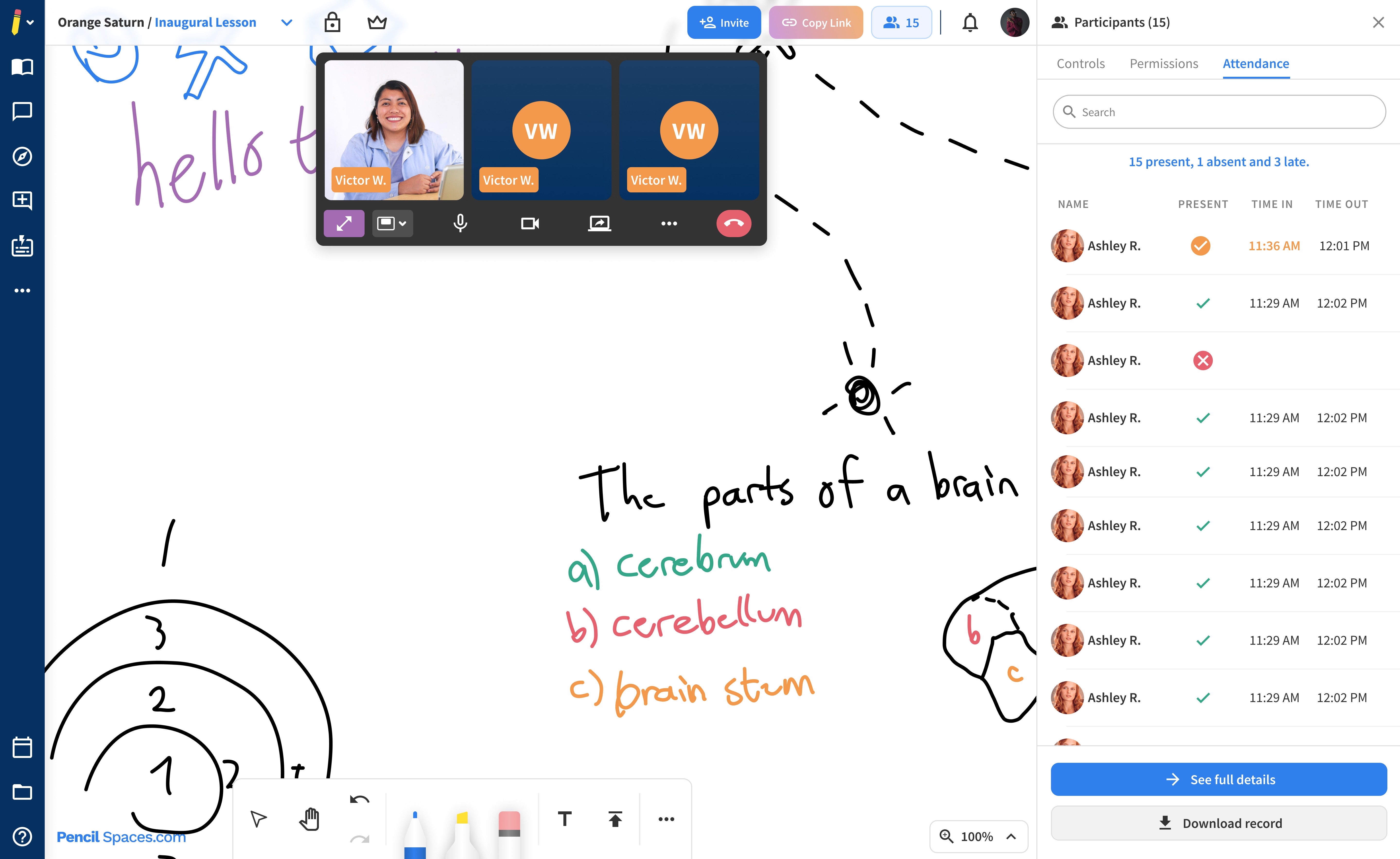
Attendance: Teachers can record Student's attendance from events made in Schedule

This was a feature request from teachers as this record was how teachers earned revenue. By recording the student's attendance and time, the teacher can provide an invoice to parents that represented their work.

1st Iteration: A list that recorded the entry and exit times of participants, but was not editable

The 1st Iteration focused on recording the status determined by the entry and exit times of participants, with actions to see the full details or download the record for business use.

By determining the status from entry time alone, the feature didn't allow flexibility of both the participant and teacher's statuses, and therefore was not an accurate representation when it came to be used as invoices.

However, this provided a problem where there could be a multitude of reasons why a participant would be recorded as 'late' but were, in fact, present. For example, a participant could be experiencing internet connection issues. By determining the status from entry time alone didn't allow flexibility of both the participant and teacher's statuses, and therefore was not an accurate representation when it came to be used as invoices.

However, this provided a problem where there could be a multitude of reasons why a participant would be recorded as 'late' but were, in fact, present. For example, a participant would join on time, but could be experiencing internet connection issues and thus be 'late'.

2nd Iteration: Editable status and quick insight of attendance

The 2nd Iteration allowed teachers the ability to change the attendance status at the teacher's discretion, providing the flexibility and accuracy of the attendance records. There was also a quick insight so that teachers can understand at a glance how many participants were present in the session, how many were late and the absences.

takeaways

Upon reflection,

The features designed in the platform allowed me to have the flexibility in understanding and creating different user experiences. The things I learned can still be applied to most, if not all, of the features I designed.

Engineering constraints and capability are influential in creating seamless user experiences. By closely collaborating with software developers, I was able to know how even the smallest details of my design could be difficult to replicate through code. This made me flexible in prioritizing which design decisions were important for the software developer to build than others.

If I could do things differently, I would do more user testing before the final design is released. Many of the improvements made on prior features were from user feedback, and thus a lot of user frustration and confusion could have been reduced if such findings were known ahead of time.

Impact

✍️

One of the standout features of this platform is its unparalleled ability to put everything in one place. From built-in apps to making websites collaborative, from the ability to upload documents to breakout rooms, Pencil Spaces offers a diverse range of tools that empower our tutors to deliver engaging and effective lessons in any subject. The platform's versatility ensures our tutors have the tools they need to tailor a session to suit the unique needs of each student.

  • NLG statement of recommendation (Client)

Awards

EdTech Awards Cool Tool Finalist 2024

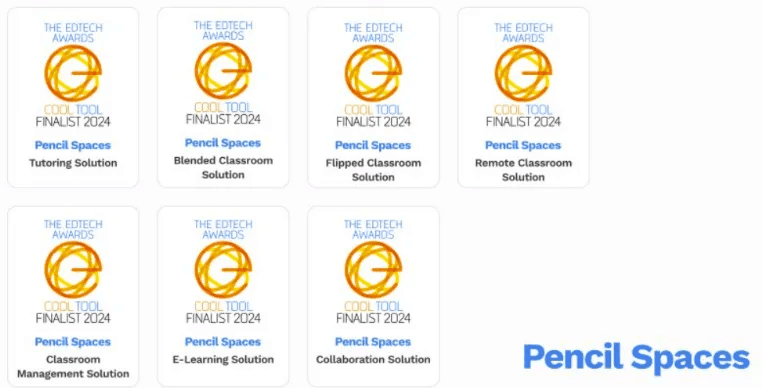
  • For Tutoring Solution

  • For Blended, Flipped and Remote Classroom Solution

  • For Classroom Management Solution

  • For E-Learning Solution

  • For Collaboration Solution

National Tutoring Awards 2024

Shortlisted for Technology Tools for Tuition

EdTechX Awards 2024

Americas Category Finalist

Tech and Learning Magazine 2024

  • Award of Excellence for Primary Education

  • Award of Excellence for Secondary Education

Thank you for reading!

More works

Sparky: AI Assistant for Teachers

User Research

Prototyping